本文主要介绍 CSS 视觉效果方面的内容
CSS 盒模型
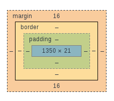
CSS 盒模型是一个盒子,用于封装HTML元素, 他包括:
- margin(外边距): 上外边距,下外边距,左外边距,右外边距, 清除外边框的区域,透明
- border(边框): 上边框,下边框,左边框,右边框, 围绕在内边距的边框, 不透明
- padding(内边距): 上内边距,下内边距,左内边距,右内边距, 清楚内容周围区域, 透明
- content(内容): 显示具体的文本,图片等内容, 不透明
块级元素(包括行内块级)的尺寸计算
CSS 属性 作用 margin 设置元素的外边距 margin-(left,right,top,bottom) 设置元素左,右,上,下外边距 border 设置元素的边框格式 border-(left,right,top,bottom) 设置元素左,右,上,下边框 padding 设置元素内边距 padding-(left,right,top,bottom) 设置元素左,右,上,下内边距 width 设置内容区宽度 height 设置内容区高度
元素总宽度计算公式:
总宽度 = margin-left + border-left + padding-left + width + padding-right + border-right + margin-right
元素总高度计算公式:
总高度 = margin-top + border-top + padding-top + height + padding-bottom + border-bottom + margin-bottom
例:
2
3
4
5
6
7
8
9
10
11
12
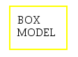
div {
margin: 15px;
padding: 10px;
border: 2px solid yellow;
width: 60px;
height: 40px;
}
</style>
<div>
BOX MODEL
</div>
元素总高度 = 15px + 3px + 10px + 60px + 10px + 3px + 15px = 116px
元素总宽度 = 15px + 3px + 10px + 40px + 10px + 3px + 15px = 96px
行内元素的尺寸
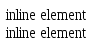
行内元素设置 margin-top, margin-bottom, width, height 无任何效果
例: 下面的两个 span 元素,一个添加了 margin-top, margin-bottom, width, height 这四个样式属性, 另一个未添加任何样式, 两者在视觉效果上没有差异
2
3
4
5
6
7
8
9
10
span.style {
margin-top: 50px;
margin-bottom: 100px;
height: 500px;
width: 100px;
}
</style>
<span class="style">inline element</span> <br>
<span>inline element</span>
块级(包括行内块级)元素水平格式属性
水平格式7大属性: margin-left、border-left、padding-left、width、padding-right
元素水平宽度: 为这七个属性宽度之和等于其父元素的 width 值 (块级元素的父元素几乎都是块级元素)
这7个属性里: width, margin-left, margin-right 这三个属性可以设置为 auto
这7个属性里,除 width 默认为 auto 外, 其他6个默认值都为 0
1、一个值为auto
如果某个元素对应这个三个属性中的某一个值为auto, 而余下两个属性指定为特定的值, 那么为auto属性会自动确定一个宽度, 从而使该元素总宽度等于父元素的 width
2、两个值为auto
- 1、margin-left, width 值为auto, margin-right 为某个具体值, 此时, margin-left 强制为 0, width 为auto, margin-right 为指定的值
- 2、with、margin-right 值为 auto, margin-left 为某个具体值, 此时, margin-right 强制为 0, width 为 auto, margin-left 为指定值
- 3、margin-left, margin-right 值为auto, width 为某个具体值,此时,该元素在其父元素中水平居中显示, 这个在开发过程中常用
3、全都为 auto
这三个属性都为 auto, margin-left、margin-right 强制为 0, width 为 auto, 即都重置为默认值
4、都不为auto
如果某个元素的这个三个属性都不是auto, 这个情况属于“过分受限(overconstrained)”, 此时会把该元素的 margin-right 强制为 auto
5、外边距为负
例如: 父元素 width 为 100px, 子元素 margin-left = 10px, margin-right = -30px, width = auto; padding-left, padding-right 都为 0
10 + 0 + width + 0 - 30 = 100 => width = 120 px, 此时,子元素宽度大于父元素宽度
2
3
4
5
6
7
8
9
10
11
12
13
14
15
div {
width: 100px;
border: 1px solid;
}
p {
margin-left: 10px;
margin-right: -30px;
width: auto;
border: 1px solid;
}
</style>
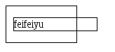
<div >
<p>feifeiyu</p>
</div>
margin-left, margin-right, padding-left, padding-right, width 的值可以设置为百分比, 即父元素width的百分比
注意: border 的宽度值无法设置为百分比
img 元素
img 作为替换元素(行内块级元素), 如果其 width 设置为 auto, 其宽度将根据图像原始宽度显示,而跟父元素宽度无关
块级(包括行内块级)元素垂直格式属性
垂直格式属性也有7个: margin-top, border-top, padding-top, height, padding-bottom, border-bottom, margin-bottom
元素高度: 为这七个属性高度之和, 不等于其父元素的 height 值
这7个属性里: height, margin-to, margin-bottom 这三个属性可以设置为 auto
这7个属性里,除 height 默认为 auto 外, 其他6个默认值都为 0
height 值为 auto
- 其子元素为行内元素(包括纯文本), 其高度将恰好足以包含其子元素,
- 如果其子元素为块级元素, 其默认高度将从最高块级子元素的外边框到最低子元素的外边框, 因此,在开发过程需要注意一点,子元素的margin会超出父元素的外边框
- 要避免这个问题,可以给父元素添加属性 border, padding 或 overflow, 此时, 父元素将会将子元素的外边距包含在块内
合并垂直外边距
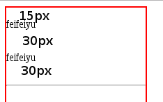
两个相邻块级元素的垂直外边距,将会合并为一个, 合并后的垂直外边距值为,两个外边距中较大的那一个, 如下所示
2
3
4
5
6
7
8
9
10
11
12
13
14
15
16
div.parent {
width: 200px;
height: 200px;
border: 2px solid red;
}
div.child {
margin-top: 15px;
margin-bottom: 30px;
}
</style>
<div class="parent" >
<div class="child"><span>feifeiyu</span></div>
<div class="child"><span>feifeiyu</span></div>
<hr>
</div>
如果为子元素设置 border, padding or overflow 属性时, 此时,子元素的外边距会包含在包含块内,
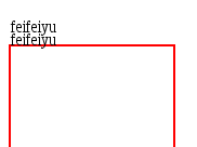
负垂直外边距
设置为负外边距时,元素会往上移动,超出父元素的范围, 或拉近两个子元素的距离
- 如果相邻两个块级元素的垂直外边距都设置为负值, 合并时,浏览器将取两个外边距中绝对值最大的那个作为合并后的外边距值
- 如果垂直外边距一个为正值,一个为负值,合并时,浏览器会从正外边距中减去负外边距的绝对值作为合并后额外边距值
2
3
4
5
6
7
8
9
10
11
12
13
14
15
16
div.parent {
margin-top: 50px;
width: 150px;
height: 150px;
border: 2px solid red;
}
div.child {
margin-top: -15px;
margin-bottom: -30px;
}
</style>
<div class="parent" >
<div class="child"><span>feifeiyu</span></div>
<div class="child"><span>feifeiyu</span></div>
</div>
行内元素视觉属性
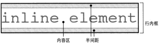
基本概念(行内盒模型)
- 匿名文本: 是指所有未包含在行内元素中的字符串。 例如: <p>hello, <span>feifeiyu </span><p> 中, hello, 就属于匿名文本
- em 框: em也称为字符框, 在字体中定义。实际的字形可能比其 em 框更高或更矮。 在CSS 中常用的 font-size 属性影响的就是 em 框的大小
- 内容区: 对于非替换元素,是指元素中各个字符的em框串联一起构成的框;对于替换元素,内容区是元素的固有高度再加上可能有的外边距,边框或内边距
- 行间距: 是指 font-size 值和 line-height 值之差。并且该差值要平分为两半, 分别应用到内容去的顶部和底部, 因此对于单行文本居中显示,可以通过使用 line-height 来实现。
- 行内框: 对于非替换元素,元素行内框的高度刚好等于行高 line-height, 对于替换元素行内框高度恰好等于内容高度。
- 行框: 包含该行中出现的行内框的最高点和最低点的最小框
行内文本垂直对齐
文本的垂直对其主要采用 CSS 属性 vertical-align 来实现
例如:
2
3
4
5
6
7
8
9
10
p {
line-height: 14px;
font-size: 14px;
}
span {
vertical-align: 14px;
}
</style>
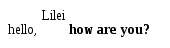
<p>hello, <span>Lilei</span><strong> how are you?</strong></p>
<span>中的文本比 <p>中的其他文本,抬升了 14px
vertical-align 属性值描述:
- baseline: 将元素的与父元素的基线对齐,(文本基线 ??)
- top: 将元素行内框与父元素的行框的顶端对齐
- bottom: 将元素的行内框与父元素的行框的底部对齐
- text-top: 将元素的行内框与父元素的内容区的顶端对齐
- text-bottom: 将元素的行内框与父元素的内容区的底段对齐
- middle: 将元素相对与父元素垂直居中
- %: 使用 “line-height” 属性的百分比值来排列此元素
行高(line-height)管理
行高(line-height): 是一种文本属性, 从浏览器显示效果来看,可以改变相邻两行间的间距
改变行内元素 line-height 可能导致文本相互重叠, 在开发过程中需要注意行高的管理
2
3
4
5
6
7
8
9
10
11
12
13
div {
width: 100px;
border: 2px solid;
}
p {
line-height: 10px;
font-size: 18px;
}
</style>
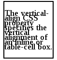
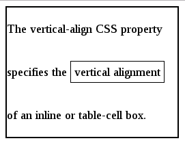
<div>
<p>The vertical-align CSS property specifies the vertical alignment of an inline or table-cell box. </p>
</div>
为了解决上述问题,设置 line-height 时使用倍数表示,例如: 想要将文档中所有元素的 line-height 都是其 font-size 的 1.5 倍,可以添加声明: body { line-height: 1.5 }。 由于 line-height 属性是可以继承的,因此该属性会往后代元素传递
行内元素的边框边界有 font-size 控制,跟 line-height 无关。即,不管如何调整 line-height 值, 只要 font-size 不变 对应元素的 border 所包含的区域高度不变。
1 | <style> |
元素角色变换
通过 CSS 的 display 属性可以方便的改变元素的显示熟悉:
属性值 效果 none 不显示 inline 该元素显示为行内元素 block 该元素显示为块级元素 inline-block 该元素显示为行内块级元素, 不会换行的块级元素, 元素的底部在文本行基线上 inherit 从父元素继承 display 属性 table-cell 该元素显示为表格单元格, 常用与 div 的垂直居中
1 | <style> |
页面布局
页面布局是指, 定义元素相对正常的文档流,或者相对于父元素、或者想对于另一个元素, 甚至浏览器窗口本身,应该出现在哪里。
实现这些,你可能会用到 float 和 position 两大常用 CSS 属性
float(浮动)
float 属性值说明:
属性值 描述 left 元素向左浮动 right 元素向右浮动 none 不浮动, 默认值 inherit 从父元素继承 float 值 例:
2
3
4
5
6
7
8
9
10
11
12
13
14
15
16
17
18
19
20
div {
width: 250px;
border: 2px solid;
padding: 10px;
}
span {
color: red;
float: left
}
.to-right {
color: yellowgreen;
float: right;
margin: 0;
}
</style>
<div>
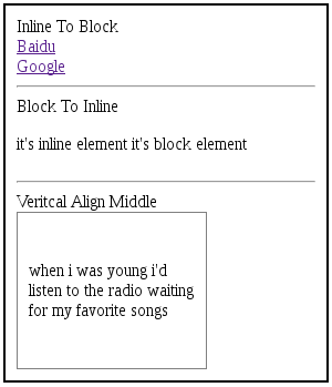
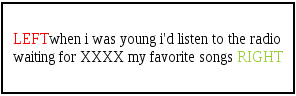
<p>when i was young i'd listen <span>LEFT</span> to the radio waiting for XXXX <span class="to-right">RIGHT</span> my favorite songs</p>
</div>
不论元素本身是块级或行内元素,添加 float 属性后都会生成一个块级框, 因此,不推荐 float:left(right), 与 display: block(inline-block) 同时添加
浮动规则:(以下对添加了 float 属性的元素称为浮动元素)
1、 浮动元素的左(或右)外边界(margin边界)不能超出其包含块的左(或右)内边界(padding 内侧)
2
3
4
5
6
7
8
9
10
11
12
13
14
15
16
17
18
19
20
21
div {
width: 270px;
border: 2px solid;
padding: 10px;
}
span {
margin: 8px;
color: red;
float: left;
}
p.to-right {
float: right;
color: yellowgreen;
margin: 8px;
}
</style>
<div>
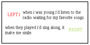
<p>when i was young i'd listen <span>LEFT1</span> to the radio waiting for my favorite songs<p class="to-right">RIGHT</p> when they played i'd sing along, it make me smile. </p>
</div>
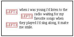
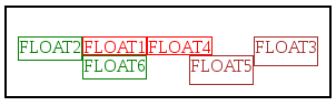
2、浮动元素的左(或右)外边界必须是源文档之前出现的左浮动(或右浮动)元素的右(或左)外边界,除非后出现浮动元素的顶端在先出现浮动元素的底端下面
这条规则可以防止浮动元素彼此”覆盖”
2
3
4
5
6
7
8
9
10
11
12
13
14
15
16
17
div {
width: 270px;
border: 2px solid;
padding: 10px;
}
span {
margin: 8px;
color: red;
float: left;
border: 1px solid;
}
</style>
<div>
<p>when i was young i'd listen <span>LEFT1</span> to the radio waiting <span>LEFT2</span> for my favorite songs when they played i'd sing along,<span>LEFT3</span> it make me smile. </p>
</div>
3、左浮动元素的右外边界不会在其右边右浮动元素的左外边界的右边;一个右浮动元素的左外边界的不会在其左边任何浮动元素的右外边界的左边。说明同一行的两个浮动元素不会重叠
4、一个浮动元素的顶端不能比其父元素的内顶端更高, 但可以比起父元素底端更低
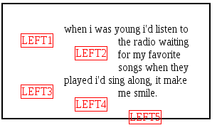
5、浮动元素的顶端不能比其前面的所有的浮动元素或块级元素的顶端更高
6、如果源文档中一个浮动元素之前出现另一个元素,浮动元素的顶端不能比包含该元素所生成框的任何行框的顶端更高
例如下图的 LEFT2, LEFT3 等,他们的顶端不会超过所在行的最高点
2
3
4
5
6
7
8
9
10
11
12
13
14
15
16
17
div {
width: 270px;
border: 2px solid;
padding: 10px;
}
span {
margin: 15px;
color: red;
float: left;
border: 1px solid;
}
</style>
<div>
<p>when i was young i'd listen <span>LEFT1</span> to the radio waiting <span>LEFT2</span> for my favorite songs when they played i'd sing along,<span>LEFT3</span> it make me <span>LEFT4</span> smile.<span>LEFT5</span> </p>
</div>
7、左(或右)浮动元素的左边(右边)有另一个浮动元素,前者的右外边界不能在其包含块的右(左)边界的右边(左边)。通俗地说,就是如果当前行放不下了,就另一起一行摆放。
8、浮动元素必须尽可能高地放置, 前提是满足前面规则的限制
9、左浮动元素必须尽量往左边界靠, 右浮动必须尽可能往右边界靠。位置越高,就会越靠近左(或右)边界
1 | <style> |
注意
文档流: 是指在浏览器视窗内,按照自上而下,从左到右的顺序摆放的元素
1、float 元素会脱离正常的文档流,且会影响正常布局
2、一个元素添加 float 属性时,其他元素会 “环绕”该元素布局
3、浮动元素周围的上下外边距不会合并
4、设置负外边距,可以使元素移动到其父元素的外面
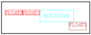
清除浮动
在前面提到浮动元素会影响到正常的文档流,为了消除这种影响,可以在对应元素上添加 clear 属性
属性值 描述 left 元素左侧没有浮动元素 right 元素右侧没有浮动元素 both 元素两侧都没有浮动元素 none 允许两侧有浮动元素 inherit 继承父类
2
3
4
5
6
7
8
9
10
11
12
13
14
15
16
17
18
19
20
21
22
23
24
25
26
27
28
29
30
31
32
33
34
div {
width: 270px;
border: 2px solid;
padding: 10px;
overflow: auto;
}
span.a {
color: red;
height: 15px;
float: left;
border: 1px solid;
}
span.c {
color:brown;
height: 25px;
float: right;
border: 1px solid;
}
div.normal {
color:aqua;
width: 90px;
clear: both; //不清除则注释
border: 1px solid;
}
</style>
<div>
<p>
<span class="a">FLOAT2</span>
<span class="a">FLOAT1</span>
<div class="normal">NOT FLOAT</div>
<span class="c">FLOAT3</span>
</p>
</div>
清楚之前:
清楚之后: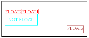
开发中常用清楚浮动样式
添加一个伪元素样式, 将其加入到目标元素的 class
2
3
4
5
6
7
8
display: block;
font-size: 0;
height: 0;
visibility: hidden;
clear: both;
content: '';
}
定位(position)属性
利用定位(position)属性可以定义元素相对于其正常位置,或相对于父元素,或另一个元素,甚至浏览器视窗, 应该出现在哪个位置
包含块
对于浮动元素包含块的是指目标元素最近的块级祖先元素, 对于定位则相对复杂:
- ”根元素“的包含块(也称初始化包含块)有浏览器建立。 在 HTML 文档中, 根元素就是 <html>元素
- 对于非根元素, 如果其 position 值是 relative 或 static, 则其包含块为最近的块级(包括行内块级)祖先元素
- 对于一个非根元素,如果其 position 值是 absolute, 则其包含块设置为最近的 position 值不是 static 的祖先元素(祖先元素可以是块级,行内,行内块级)
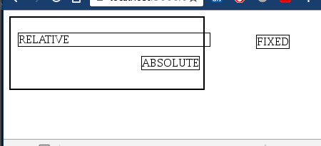
position 属性
1、static, 默认值
元素正常显示, 块级元素生成一个矩形框, 作为文档流的一部分;行内元素则会创建一个或多个行框, 置于父元素中
2、relative
元素相对与其包含块偏移, 元素仍保持其未定位前的形状, 它原本在文档流中所占空间仍保留
3、absolute
元素从文档流中删除, 并相对于其包含块定位,
4、fix
表现类似 absolute, 不过其相对位置(包含块)是浏览器视窗
偏移属性
对于 position 属性值设置为(relative or absolute or fixed) 的元素,可以使用偏移属性来完成元素的定位
偏移属性有4种: top, right, bottom, left。他们的属性值可以为 length(px, rem等), 百分比, auto, inherit, 默认: auto
1、top 描述了元素上外边界离其包含块顶端的偏移位置, 如果 top 为正值,则该元素上边界相对于其包含块顶端下移; 为负值, 则该元素上边界相对于其包含块顶端上移
2、left 描述了元素左外边界离其包含块顶端的偏移位置, 如果 left 为正值,则该元素左外边界相对于其包含块右侧移动; 为负值,则该元素左外边界相对于其包含块左侧移动
3、bottom 描述了元素下外边界离其包含块底端的偏移位置
如果 position 值为 relative 时, bottom 值为正时,该元素相对于其正常位置上移, bottom 值为负时,该元素相对于其正常位置上移, 与 top 同时使用时,无效
如果 position 值为 absolute or fixed 时, bottom 值为正时, 该元素相对于其包含块下边界上移, bottom 值为负时, 该元素相对于其包含块下边界下移, 与 top 同时使用时会改变元素本身尺寸(假如没有 height 属性限制)
4、right 描述了元素右外边界离其包含块底端的偏移位置
如果 position 值为 relative 时, right 值为正时,该元素相对于其正常位置左移, right 值为负时,该元素相对于其正常位置右移, 与 left 同时使用时,无效
如果 position 值为 absolute or fixed 时, right 值为正时, 该元素相对于其包含块右边界左移, right 值为负时, 该元素相对于其包含块右边界右移, 与 left 同时使用时会改变元素本身尺寸(假如没有 width 属性限制)
1 | <style> |
内容溢出及裁剪
如果子元素尺寸超过父元素, 或元素内容过长时,就会出现溢出的情况,为了保持页面的美观,需要对这部分内容进行裁剪
CSS 使用 overflow 属性对超出的部分进行裁剪
属性值 描述 visibile 元素的内容在元素框之外也可见 hidden 元素的内容在元素框之外不可见 scroll 元素生成滚动条,可以滚动显示全部内容 auto 由浏览器来确定采用何种方式 inherit 继承祖先
例子
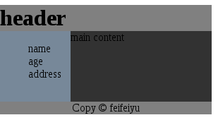
header 头部导航定位为 postion: fixed,不管页面是否滚动都浮在浏览器视窗顶部
侧边栏靠左侧显示,float: left;
正文部分紧靠左侧边栏: 同样 float: left;
页面底部信息: 按照正常文档流显示
1 | <style> |